

When Fujifilm first announced Fuji Pro 400h would be discontinued, I was stunned. I had spent the last 6 years working with this film, honing my color palette, becoming an expert in how to use it in all lighting situations. With my film lab, Richard Photo Lab, I had refined my color profile for scanning my film, and now, just when I was really loving my images, it felt like I would have to begin again from scratch.
I first started working with film professionally in 2014, and at that time I had tested Portra 400, but I had never quite liked the yellow undertones. Turns out, I had been trying to use Portra 400 like Fuji 400h, overexposing the film more than it needed to be.
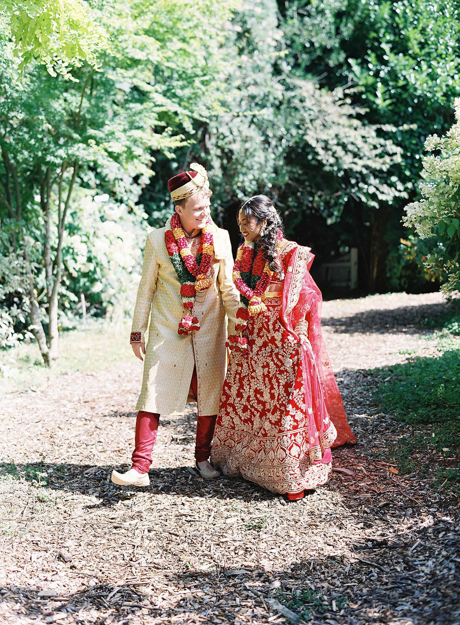
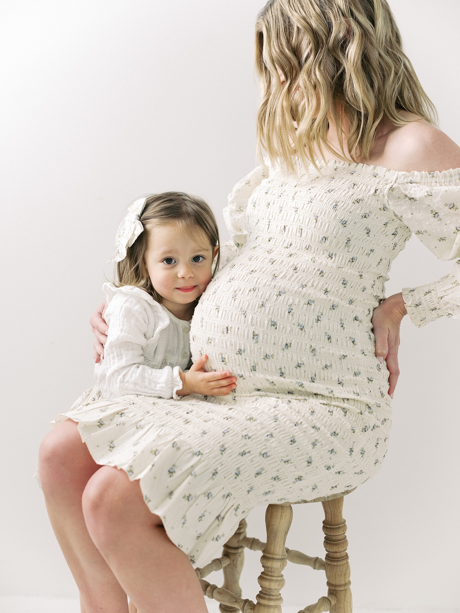
So after the initial wave of shock, I put on my scientist hat and set out to test and learn how I can shoot Portra 400 with a similar color palette to my work with Fuji 400h. The first test was to bracket 4 stops for both Fuji 400h and Portra 400, metered for shadows, bulb in. Richard Photo Lab scanned my images as close to my color profile as they could get it. Click the images to view them larger:
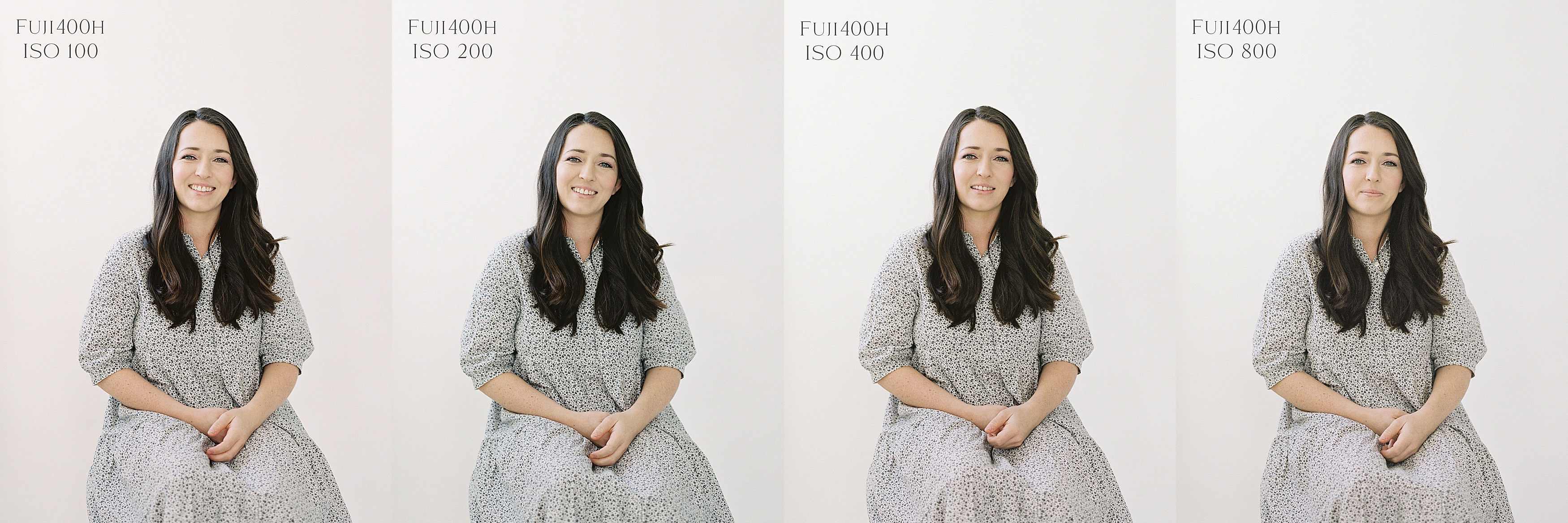
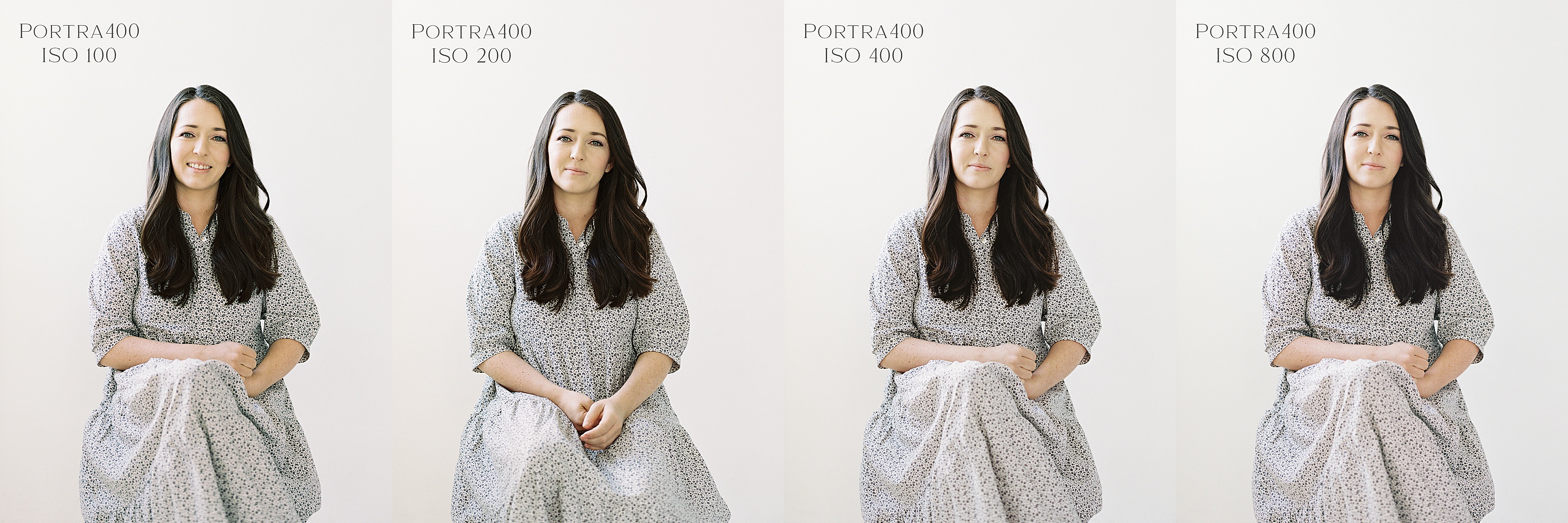
The first thing that struck me about this test is that none of them really look that bad, which to me is the beauty of film. If you overexpose a digital image 3 or 4 stops you will blow out your highlights to where the detail is unrecoverable. But of course there is a nuanced difference in the colors that are important for honing in just the right palette for neutral skin tones.
I typically shoot Fuji 400h rated at ISO 200. It gives a really beautiful pink tone and I personally like the cooler undertone of the film with some blues in the shadows. To me, that is the sweet spot for my cool to neutral color balanced images.
As you can see in this bracket test, colors start to get a bit weird with Portra 400 the more it is overexposed. You can see more yellow and orange in her skin tone, which is not as flattering. The sweet spot instead is rating Portra 400 at ISO 400.
And even still, if you did end up overexposing Portra 400 a little too much and want to edit out the yellow undertone, a quick fix in Lightroom made it looking pretty again!
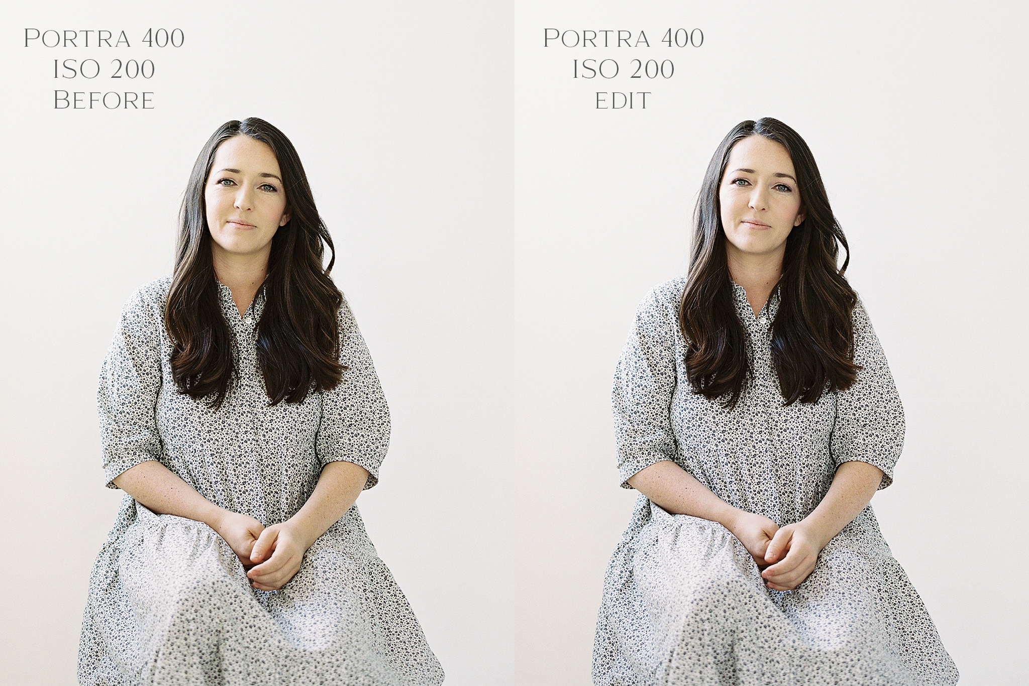
What did I do to achieve the edit on the right? It was a simple adjustment in the Midtones in the Color Grading panel (Lightroom 10). First you identify the color you are trying to neutralize, which in the left image is a yellow-green and then you move the little circle at the center of the Midtones color wheel in the opposite direction. For this particular image it is set at Hue 246 Sat 11. That one adjustment brought back the magenta/blues that I so dearly love and see in Fuji 400h!
Need a tutorial on how to edit this? I created a video HERE!
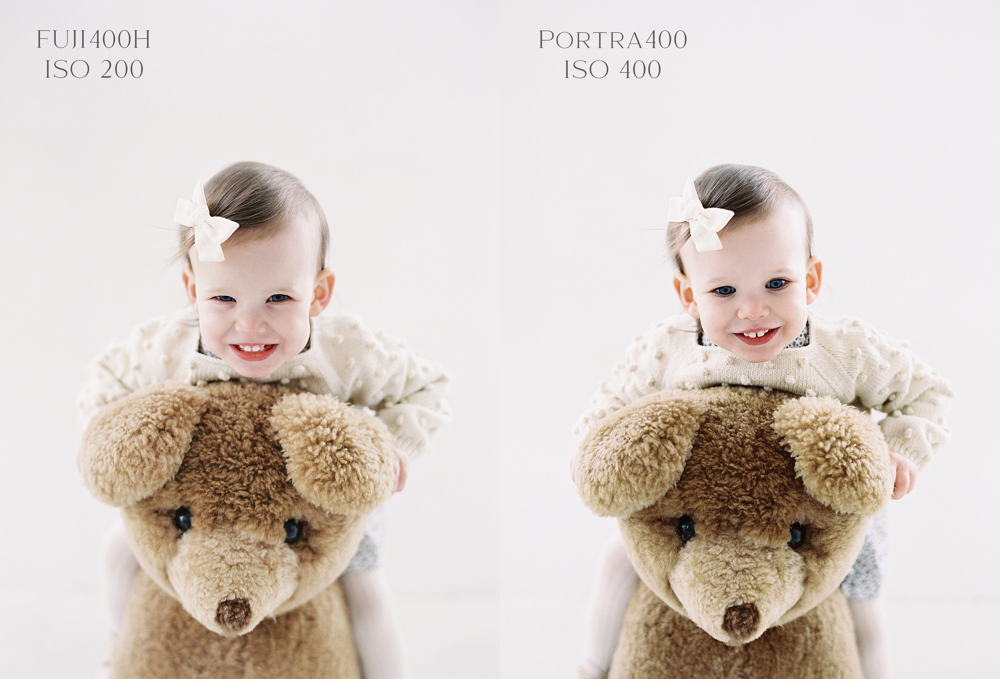
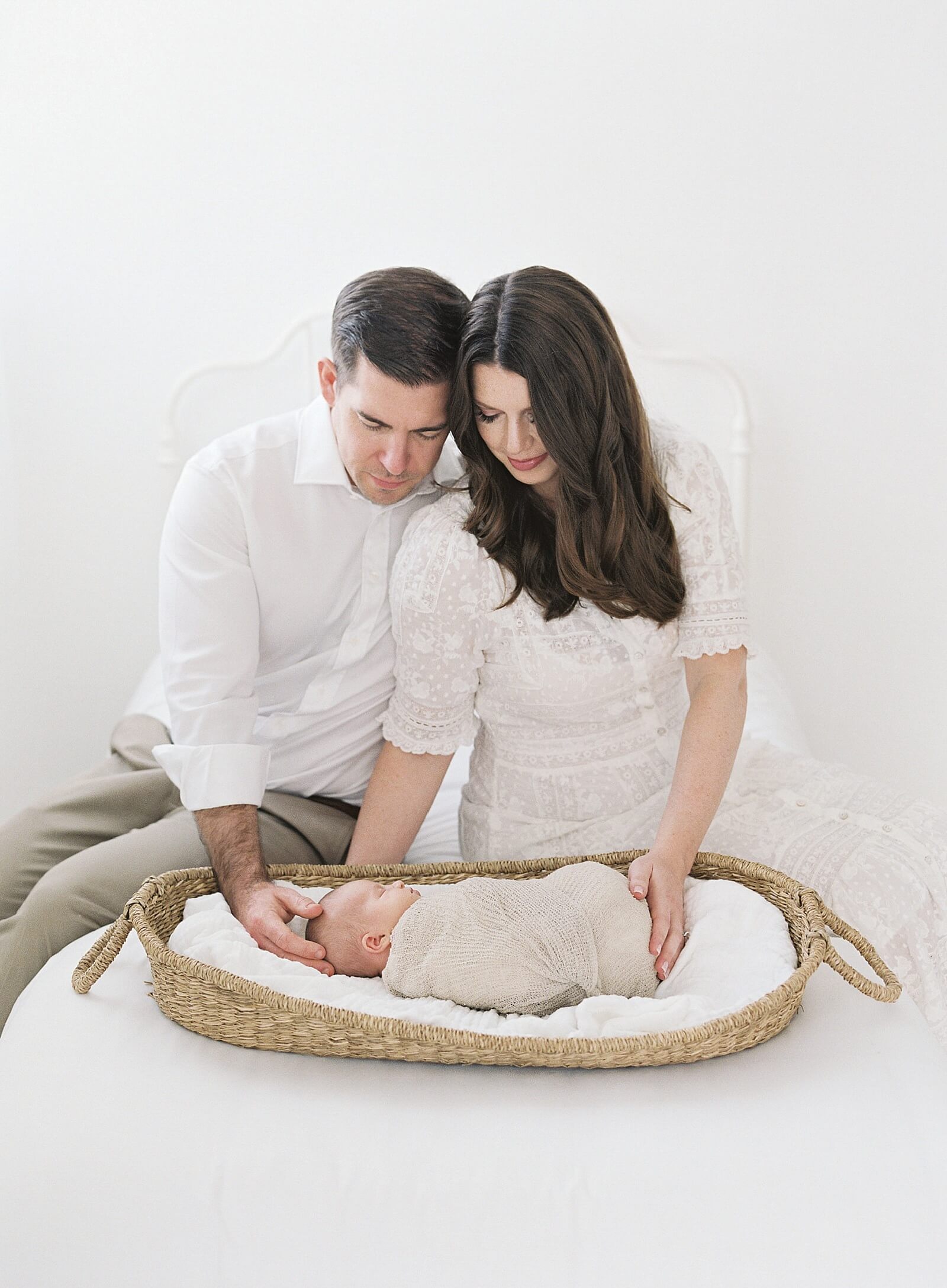
Now, back to shooting Portra 400 rated at 400. This comparison blew my mind at just how close the overall color tones were to each other between Fuji 400h and Portra 400. There are some obvious differences in the shadows, but it is incredible how the highlights are so similar. And as you will see in the mix of the following images, these two films can get very close in look and feel if scanned well by film pros like Richard Photo Lab.
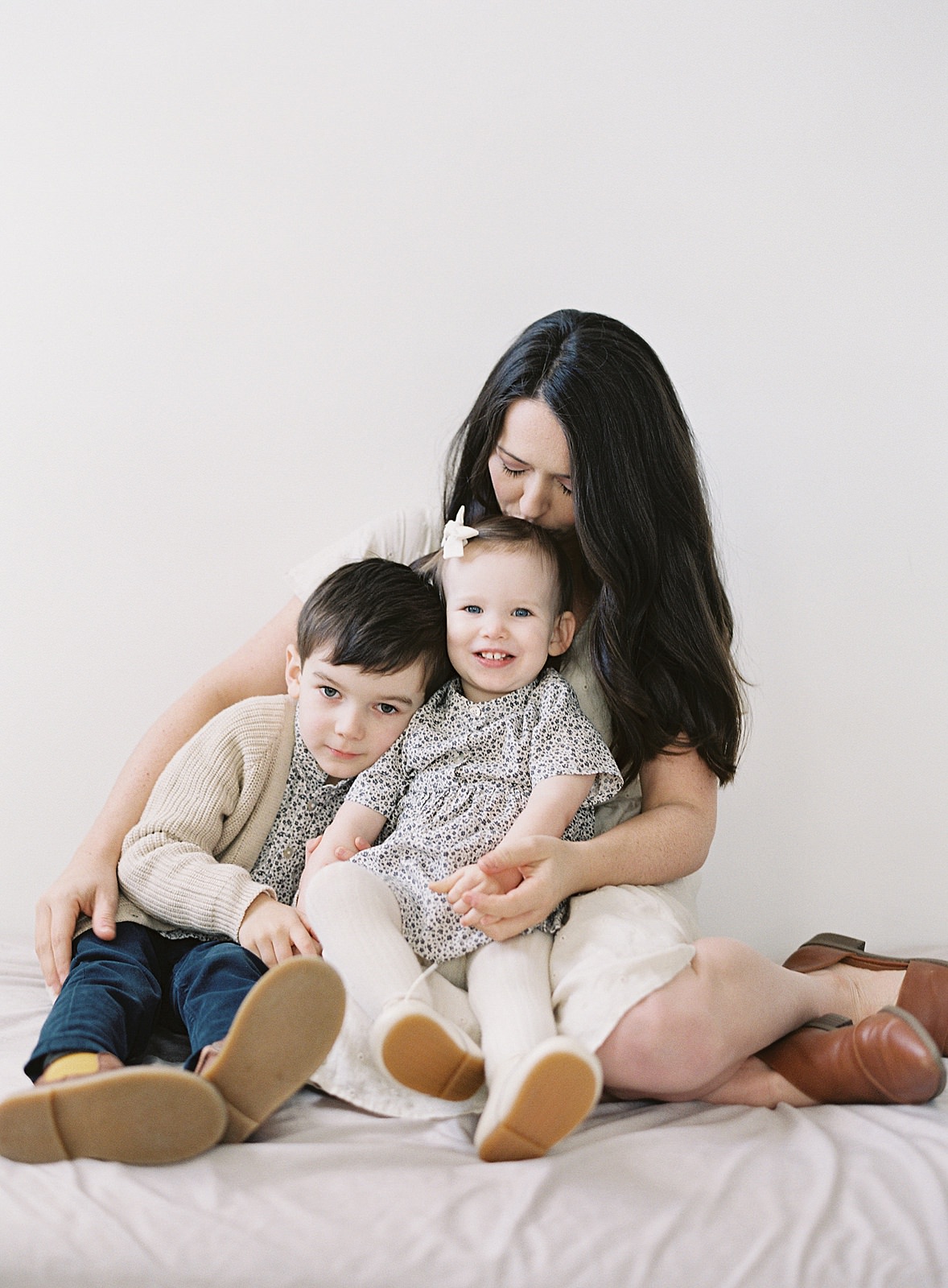
Fuji400h 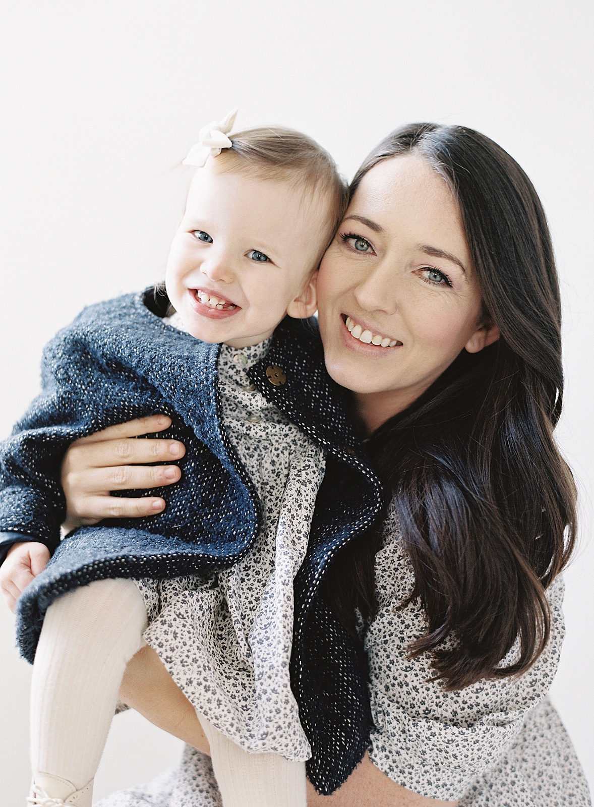
Portra400 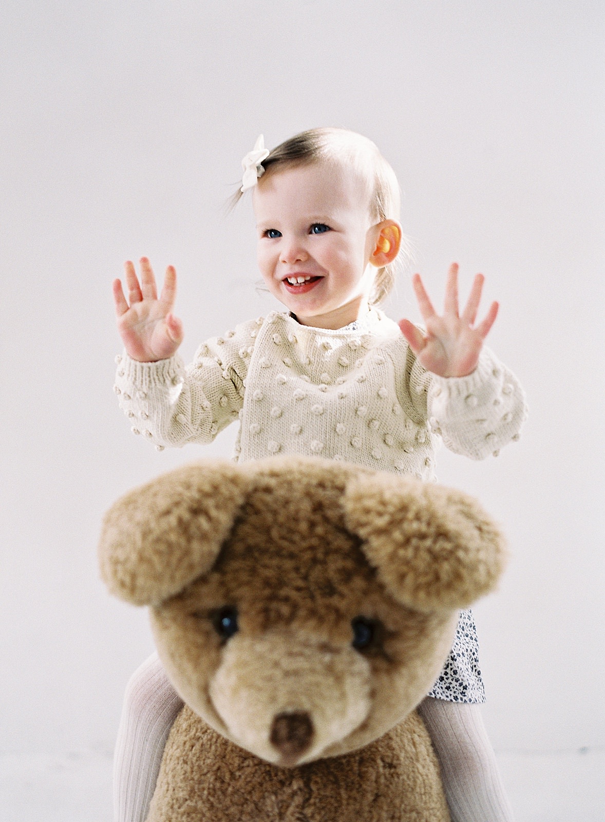
Fuji400h 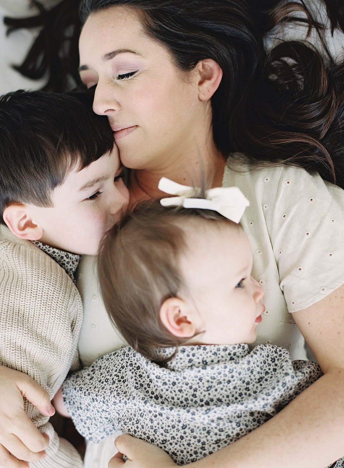
Portra400 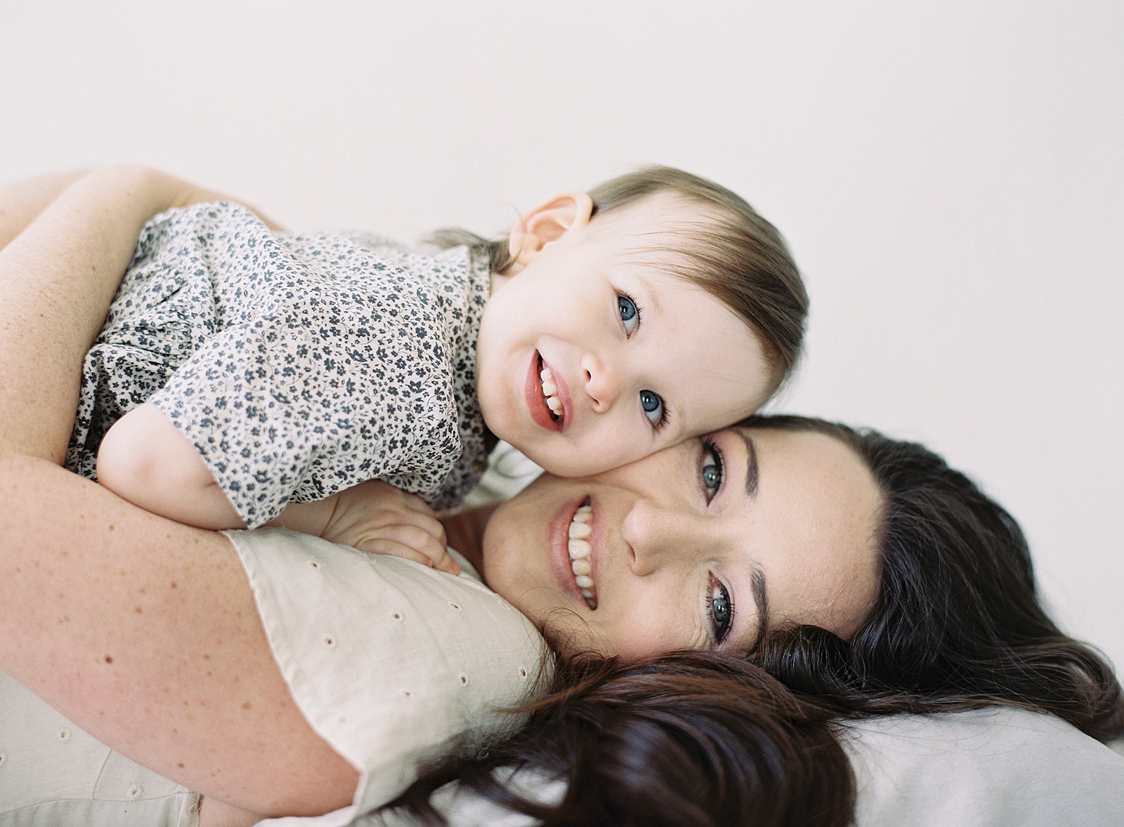
Portra400 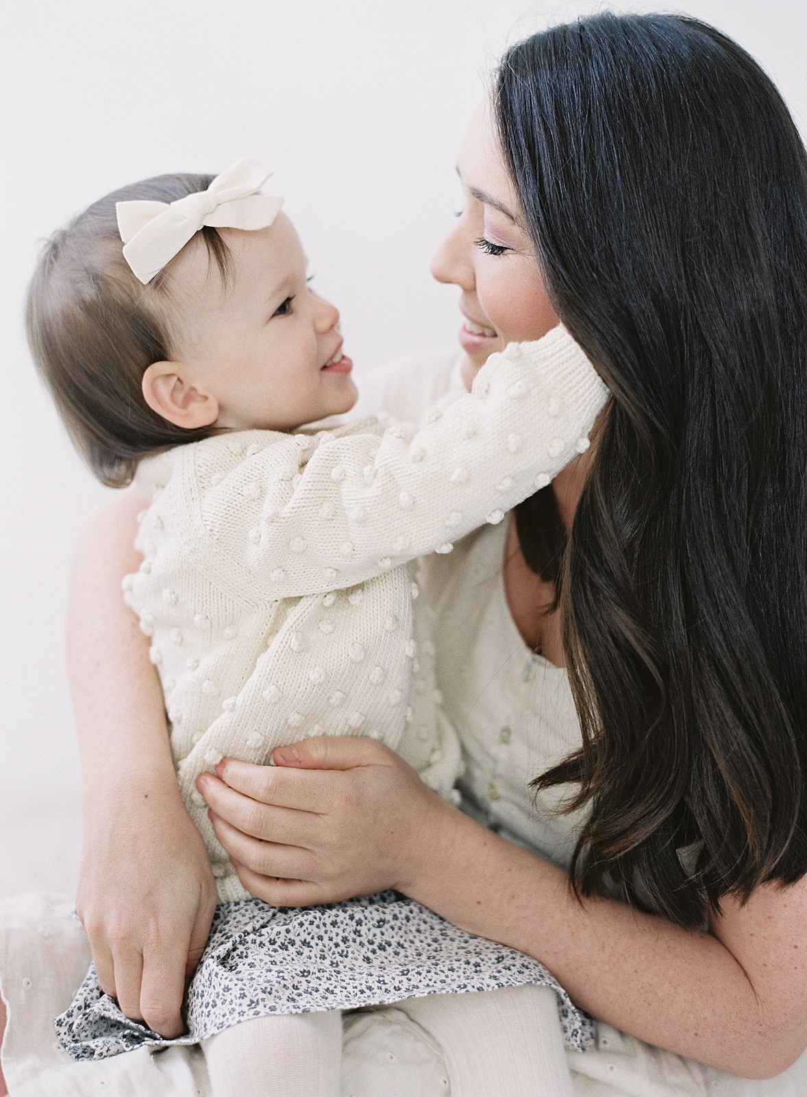
Fuji400h
While I still have more testing to do, especially in outdoor settings with lots of green, this gave me the confidence that I needed to move forward working with Portra 400 rated at 400. I will never lose my love for the beautiful pastels in Fuji 400h film, but I am so thankful to my film lab for working with me on a solution that will continue my artistic journey in a beautiful direction.


add a comment
+ COMMENTS